Arch
Team
Service
Marketing site redesign
Year
2024
Link
Arch.dev
Overview
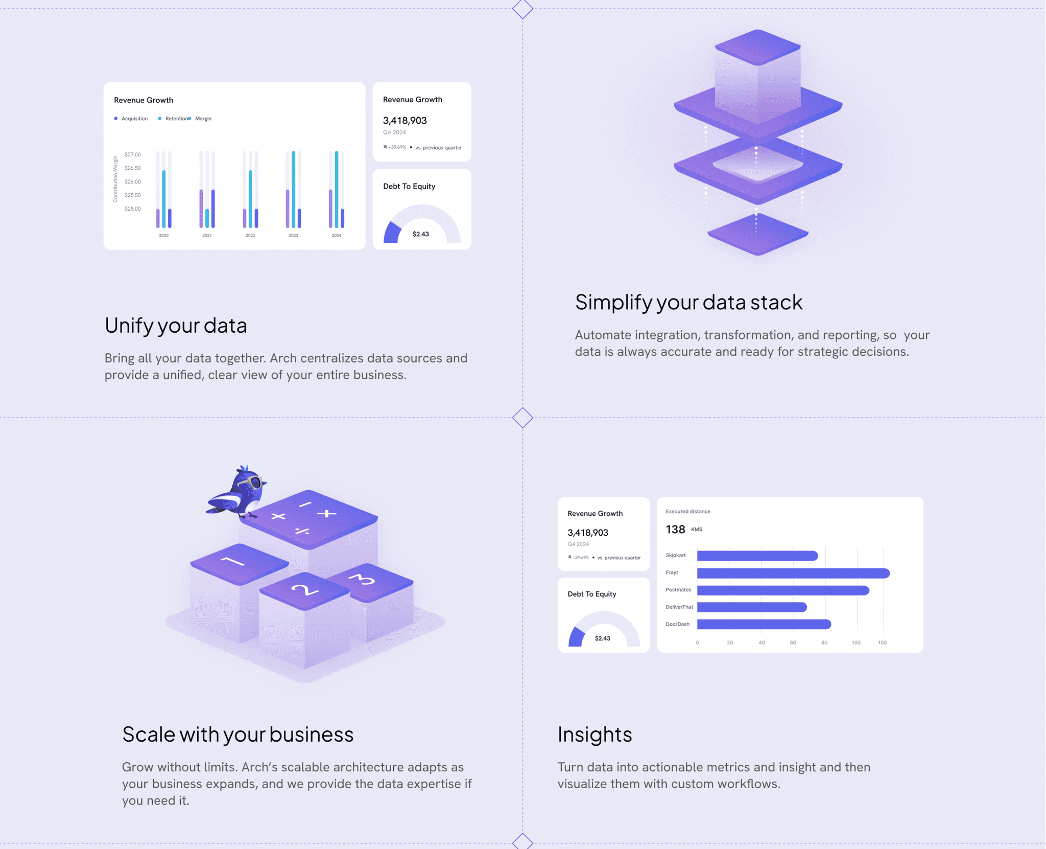
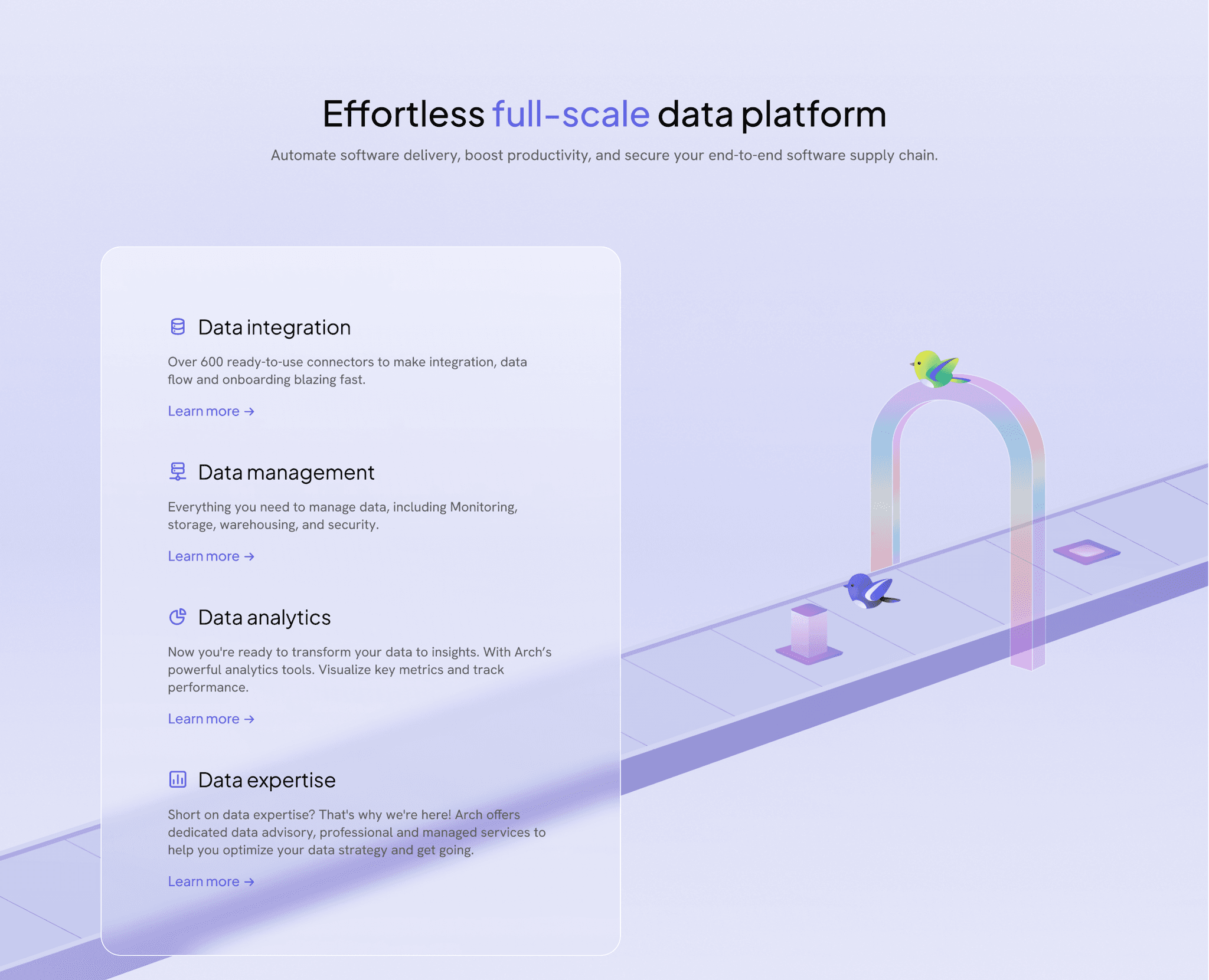
Arch is a data intelligence company that aids businesses access any data source, store, or ML model from a single endpoint. It helps them in making informed decisions by offering AI-driven metrics and expert analysis.
Project scope
As a product designer at BABCO, I contributed to Arch's product redesign, helping refine its story and better align with audience needs. This case study covers the marketing site redesign that resulted from this collaboration.
Problems
Arch's previous marketing site was complex and developer-focused, with cluttered layouts that could confuse non-technical users. To differentiate itself, Arch should adopt an approachable, user-friendly design that makes data analysis accessible to all businesses.
Similar solutions
Tembo
Tembo another project by BABCO design agency, is a developer platform for Postgres databases that simplifies app building and scaling. Its user-friendly design makes it accessible to both developers and non-technical users, providing robust database solutions with ease.
Waterso
MotherDuck is a cloud-native database platform with a developer focus, featuring an intuitive, friendly interface. Its playful design and welcoming tone make it accessible and enjoyable to navigate, even for non-experts.
Key Design Problems and solutions
First round of redesign, with rebranding in progress
Color combination
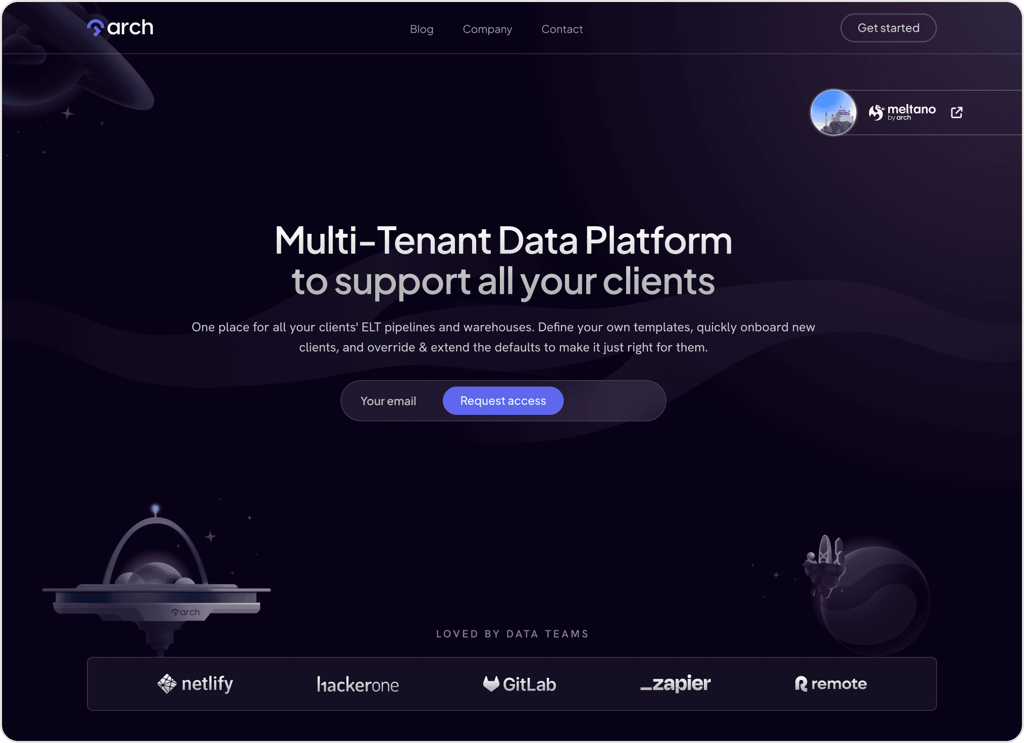
The interface felt complex and overwhelming due to a dark, dense color scheme.
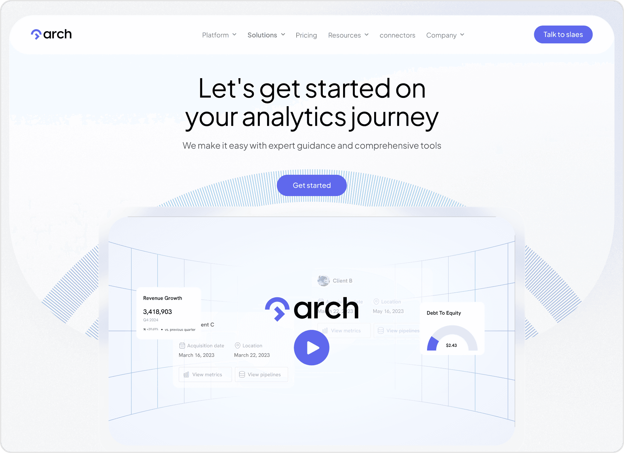
We introduced a lighter palette and rounded elements to create a more inviting design.
Redesigning for All Users
A developer-focused aesthetic made the platform hard for non-expert users to navigate.
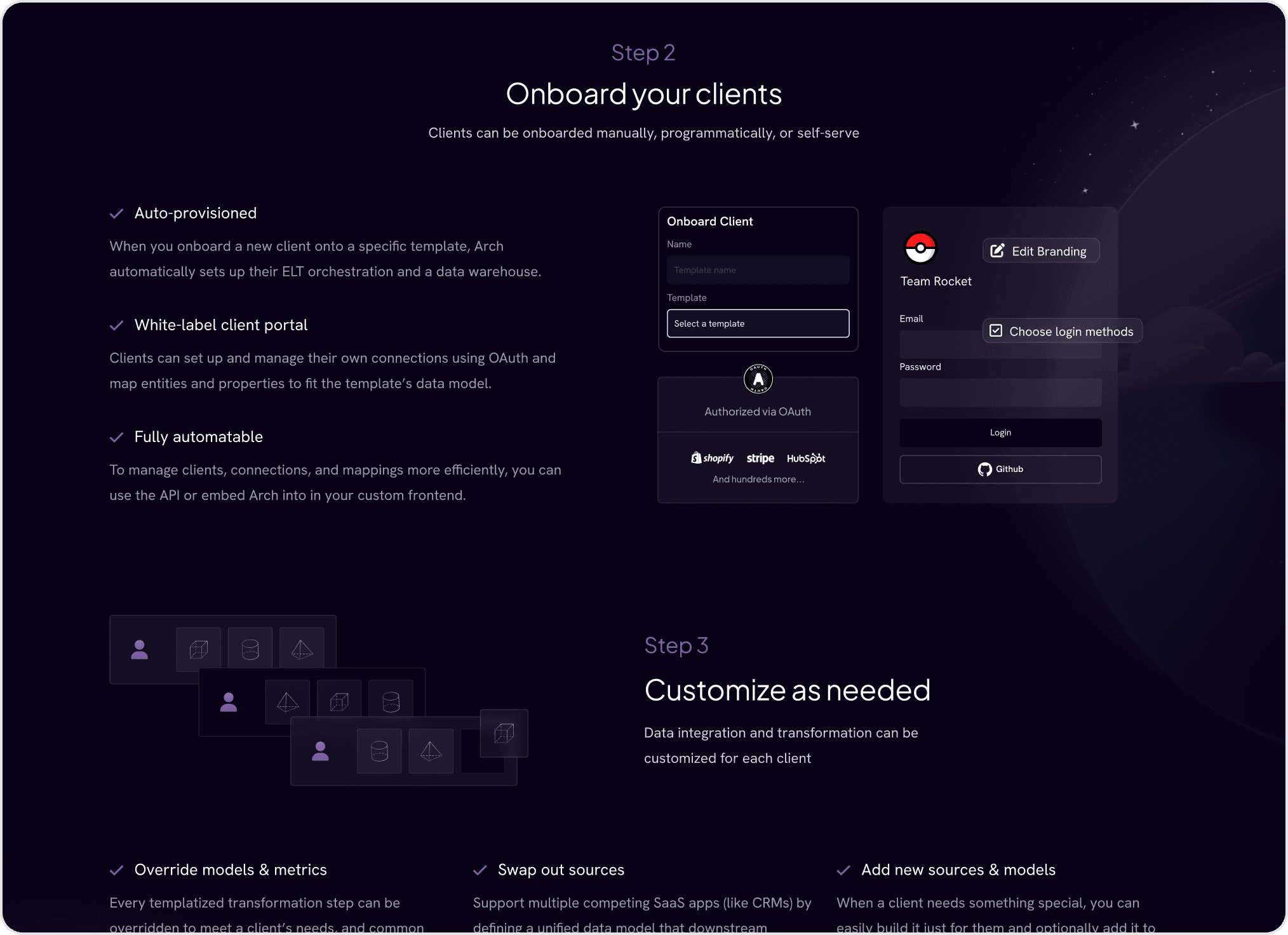
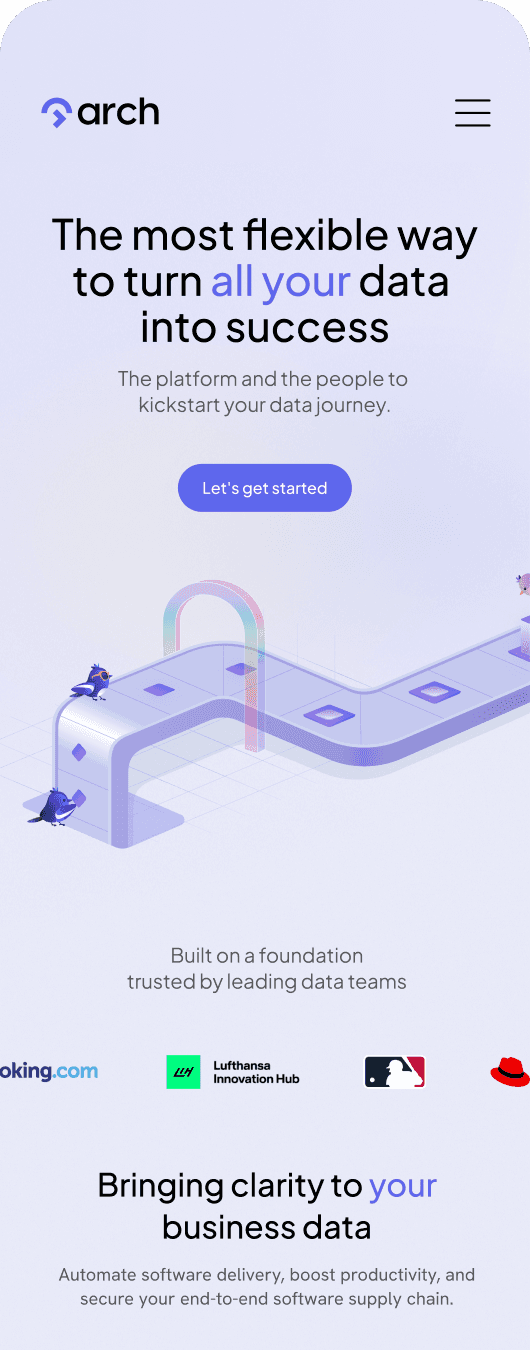
We updated the design to look more friendly and accessible, making it approachable for a wider audience unfamiliar with technical platforms.
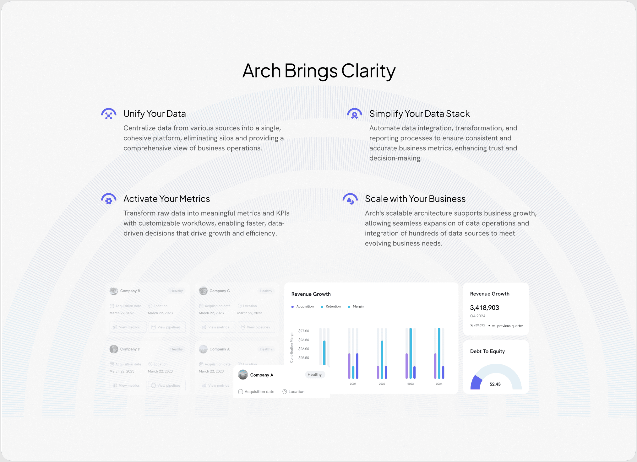
Enhancing Navigation
Uniform page layouts created a monotonous and confusing navigation experience.
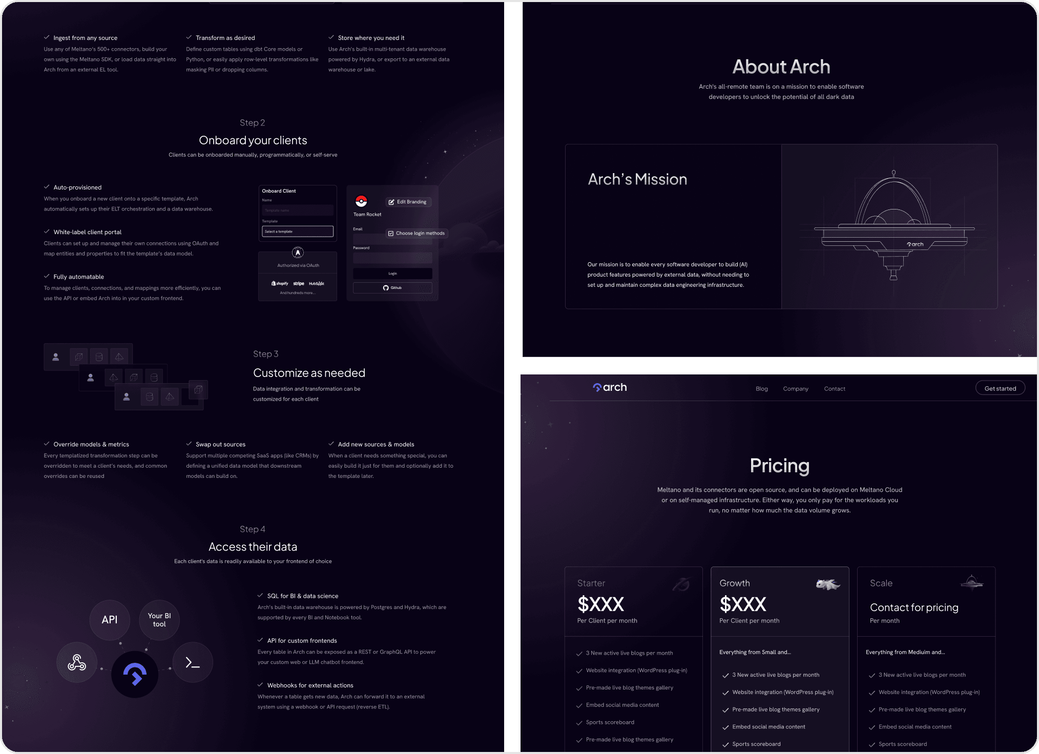
We diversified layouts and added color-coded sections, helping users find information quickly.
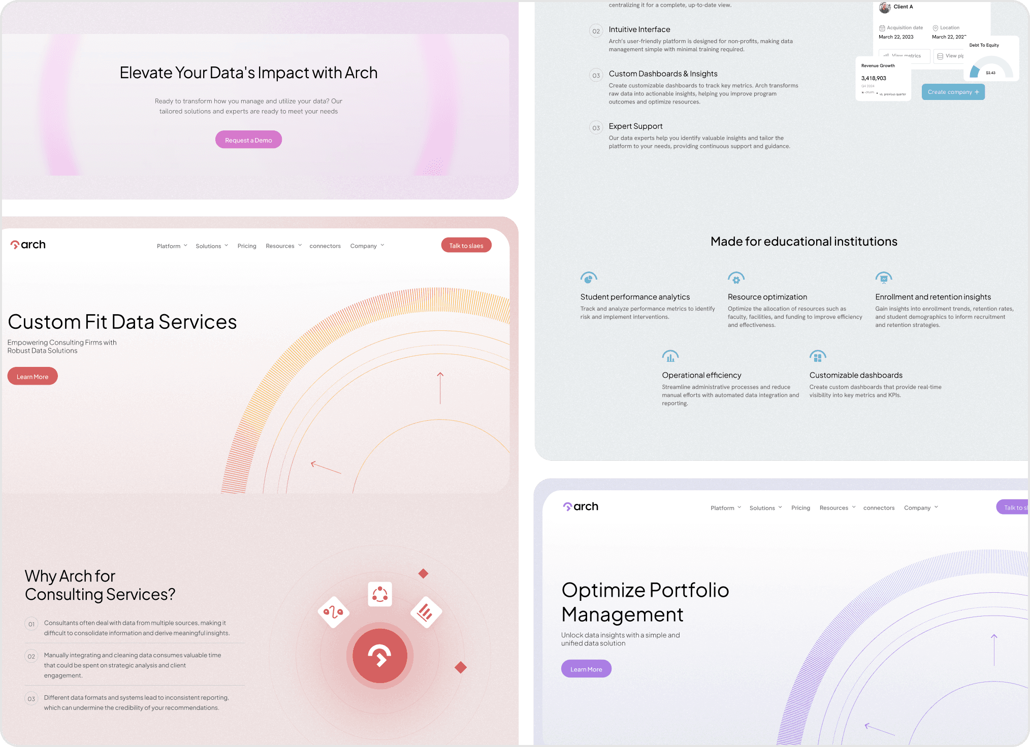
Brand character
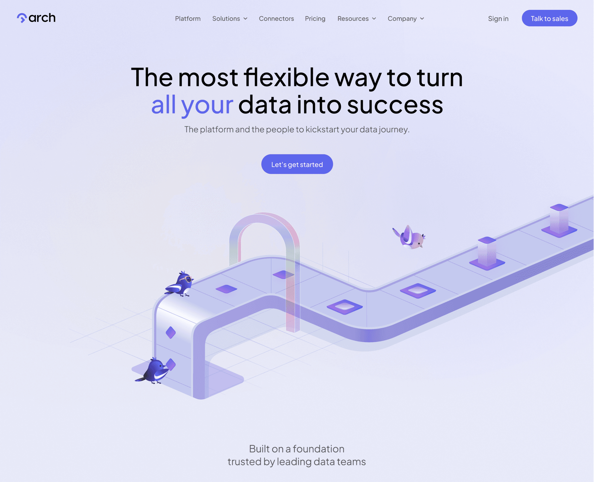
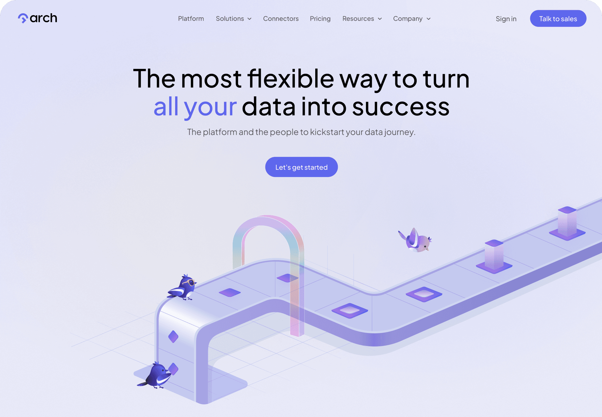
We chose magpie for Arch branding character because its intelligence, adaptability, and communicative nature reflect Arch’s dedication to insightful, secure, and client-entered data analysis.
We also chose to show the journey that the data goes through by the birds working on a conveyor belt for the hero Illustration.

Final Design
View live site
